64 ^ 2 # 4096
## [1] 4096
3432 / 8 # 429
## [1] 429
96 * 72 # 6912
## [1] 6912
Exercise solutions
Exercise 1
- Open a new script file if you have not already done so.
- Save this script file into an appropriate location.
Solutions
- To open a new R script, click the
 icon and select ‘R script’.
 - Save this file by following File -> Save as… from the drop-down menu, selecting the folder you are working from in this course, and giving the file an appropriate name.
Exercise 2
- Add your name and the date to the top of your script file (hint: comment this out so R does not try to run it)
- Use R to calculate the following calculations. Add the result to the same line of the script file in a way that ensures there are no errors in the code.
- \(64^2\)
- \(3432 \div 8\)
- \(96 \times 72\)
When you have finished this exercise, select the entire script file (using Ctrl + a on windows or Command + a on Mac) and run it to ensure there are no errors in the code.
Solutions
Add a
#symbol to the script file before printing your name and the date,After running the calculation, copy and paste the result after a
#symbol to ensure there are no errors:
Exercise 3
How many local authorities were included in the London region?
Give three different ways that it would be possible to select all spend variables (sfa_2020, nhb_2020, etc.) from the CSP_2020 dataset.
Create a new tibble,
em_2020, that just includes local authorities from the East Midlands (EM) region.
- How many local authorities in the East Midlands had an SFA of between £5 and 10 million?
- Create a new variable with the total overall spend in 2020 for local authorities in the East Midlands.
Solutions
- First
filterthe data to return only rows which belong to the London region, then count the number of rows in this subgroup:
csp_2020 %>%
  filter(region == "L") %>%
  count()
## # A tibble: 1 × 1
##       n
##   <int>
## 1 34- There are many different ways to select variables from a dataset. For a list of selection helpers, check the helpfile
?tidyr_tidy_select. Some example include:
# Using the : symbol to return consecutive columns

# By variable name:
select(csp_2020, sfa_2020:rsdg_2020)

# Or by column number:
select(csp_2020, 4:9)

# Returning all variables with names ending "_2020"
select(csp_2020, ends_with("_2020"))

# Return all numeric variables
select(csp_2020, where(is.numeric))

# Return all variables that are not character
select(csp_2020, where(!is.character))- To create a new tibble, use
filterto select the subgroup where region is “EM”, and attach as an object using the<-symbol
em_2020 <- filter(csp_2020, region == "EM")- Use
filterto select the subgroup and thencountthe number of rows:
em_2020 %>%
  filter(between(sfa_2020, 5, 10)) %>%
  count()
## # A tibble: 1 × 1
##       n
##   <int>
## 1 3- Use the
mutatefunction to create a new variable from the existing ones. Hint: If you are not sure of the variable names in the data, use thenamesfunction and copy them from the console:
names(em_2020)
## [1] "ons_code"         "authority"        "region"           "sfa_2020"
## [5] "under_index_2020" "ct_total_2020"    "nhb_2020"         "nhb_return_2020"
## [9] "rsdg_2020"


em_2020 <- em_2020 %>%
  mutate(total_spend = sfa_2020 + under_index_2020 + ct_total_2020 +
           nhb_2020 + nhb_return_2020 + rsdg_2020)
Exercise 4
- Create a data frame with the minimum, maximum and median total spend per year for each region.
- Produce a frequency table containing the number and percentage of local authorities in each region.
- Convert the data object
csp_long2back into wide format, with one row per local authority and one variable per total spend per year (HINT: start by selecting only the variables you need from the long data frame). Use the help file?pivot_widerandvignette("pivot")for more hints. - Using your new wide data frame, calculate the difference in total spending for each local authority between 2015 and 2020. How many local authorities have had an overall reduction in spending since 2015?
Solutions
- Use the
summarisefunction after grouping by theyearandregionvariables:
csp_long2 %>%
  group_by(region, year) %>%
  summarise(min_spend = min(total_spend),
            max_spend = max(total_spend),
            median_spend = median(total_spend)) %>%
  ungroup()
## # A tibble: 54 × 5
##    region  year min_spend max_spend median_spend
##    <chr>  <dbl>     <dbl>     <dbl>        <dbl>
##  1 EE      2015         0      883.         15.9
##  2 EE      2016         0      860.         16.2
##  3 EE      2017         0      845.         15.0
##  4 EE      2018         0      860.         14.4
##  5 EE      2019         0      874.         14.7
##  6 EE      2020         0      915.         15.2
##  7 EM      2015         0      492.         12.4
##  8 EM      2016         0      479.         12.0
##  9 EM      2017         0      475.         11.1
## 10 EM      2018         0      483.         11.0
## # ℹ 44 more rows- To calculate the percentage of local authorities in each region, we need the total number in each region and the overall number of local authorities:
# Use the csp_2020 data as only require one row per local authority
csp_2020 %>%
  # Begin by calculating number of local authorities per region
  group_by(region) %>%
  # Count number of rows in each group
  summarise(n_la_region = n()) %>%
  ungroup() %>%
  # Create a new variable with the total number of local authorities (the sum)
  mutate(n_la_overall = sum(n_la_region),
         # Calculate the percentage (and round to make easier to read)
         perc_la_region = round((n_la_region / n_la_overall) * 100, 2)) %>%
  # Remove the total local authority column
  select(-n_la_overall)
## # A tibble: 9 × 3
##   region n_la_region perc_la_region
##   <chr>        <int>          <dbl>
## 1 EE              57          14.4
## 2 EM              51          12.9
## 3 L               34           8.59
## 4 NE              15           3.79
## 5 NW              46          11.6
## 6 SE              81          20.4
## 7 SW              47          11.9
## 8 WM              38           9.6
## 9 YH 27 6.82- Use the
pivot_widerfunction, use the year to set the new variable names suffix (names_from =), add a prefix to avoid variable names beginning with a number (names_prefix =), and take thevalues_fromthe currenttotal_spendcolumn:
csp_total_wide <- csp_long2 %>%
  # Select variables to keep
  select(ons_code:year, total_spend) %>%
  pivot_wider(names_from = year,
              names_prefix = "total_spend_",
values_from = total_spend)- Begin by using
mutateto create a variable with the difference between total spend 2015 - 2020. Usefilterto return rows where there is a reduction in spend,countthe number of rows:
csp_total_wide %>%
  mutate(total_diff = total_spend_2020 - total_spend_2015) %>%
  filter(total_diff < 0) %>%
  count()
## # A tibble: 1 × 1
##       n
##   <int>
## 1   234
Exercise 5
- Create a new data object containing the 2020 CSP data without the Greater London Authority observation. Name this data frame
csp_nolon_2020. - Using the
csp_nolon_2020data, create a data visualisation to check the distribution (or shape) of the SFA variable. - Based on the visualisation above, create a summary table for the SFA variable containing the minimum and maximum, and appropriate measures of the centre/average and spread.
Solutions
- Create a new object using the
<-symbol, usefilterto remove the duplicate row:
csp_nolon_2020 <- filter(csp_2020, authority != "Greater London Authority")- Histograms are used to check the distribution of numeric variables:
ggplot(data = csp_nolon_2020) +
  geom_histogram(aes(x = sfa_2020))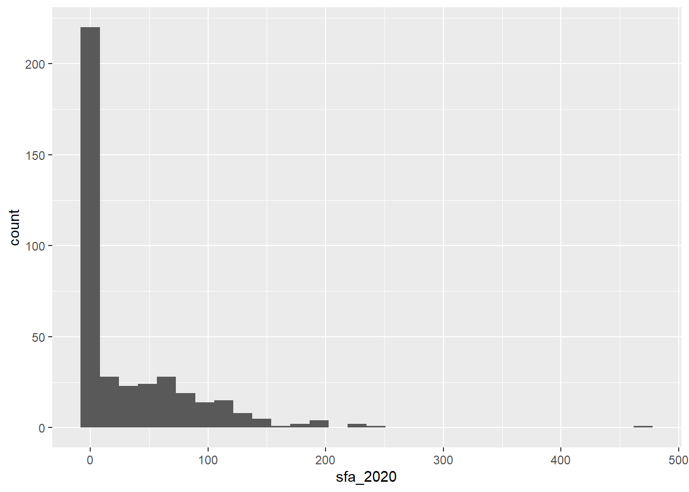
- The histogram shows that the
sfa_2020variable is very skewed, therefore themedianandIQRare the most appropriate measures of centre and spread:
summarise(csp_nolon_2020,
          min_sfa = min(sfa_2020),
          max_sfa = max(sfa_2020),
          median_sfa = median(sfa_2020),
          iqr_sfa = IQR(sfa_2020))
## # A tibble: 1 × 4
##   min_sfa max_sfa median_sfa iqr_sfa
##     <dbl>   <dbl>      <dbl>   <dbl>
## 1       0    470.       4.62    54.7
Exercise 6
- What is the problem with the following code? Fix the code to change the shape of all the points.
ggplot(csp_nolon_2020) +
  geom_point(aes(x = sfa_2020, y = ct_total_2020, shape = "*"))
Add a line of best fit to the scatterplot showing the relationship between SFA and council tax total (hint: use
?geom_smooth).Add a line of best fit for each region (hint: make each line a different colour).
Solutions
- Only aesthetics determined by variables in the data should lie inside the
aesfunction, theshapeargument should be outside of this:
ggplot(csp_nolon_2020) +
  geom_point(aes(x = sfa_2020, y = ct_total_2020), shape = "*")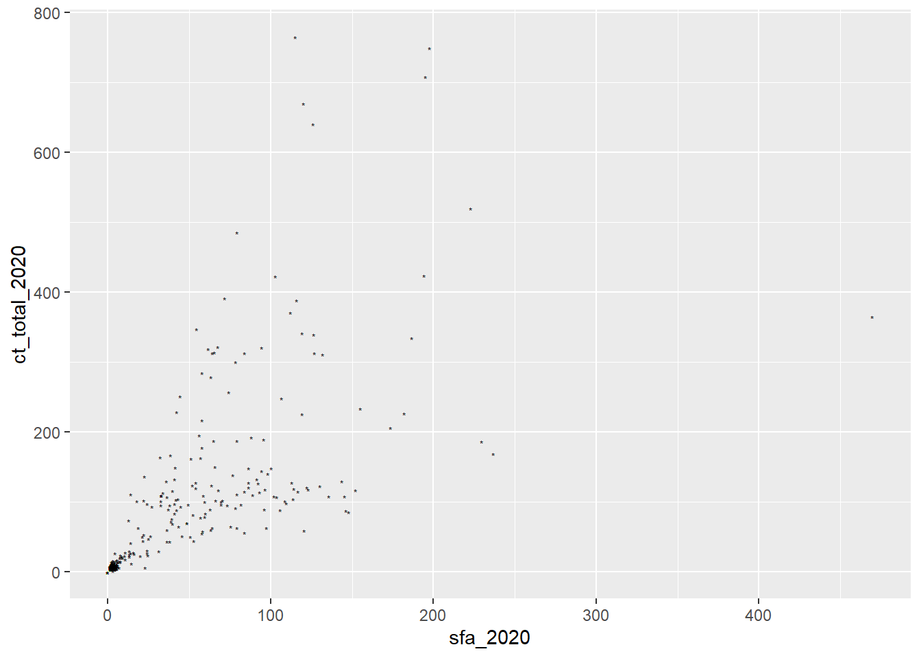
- The function
geom_smoothadds a line of best fit, make sure to setmethod = lmto fit a linear trend:
ggplot(data = csp_nolon_2020, aes(x = ct_total_2020, y = sfa_2020)) +
  geom_point() +
  geom_smooth(method = "lm")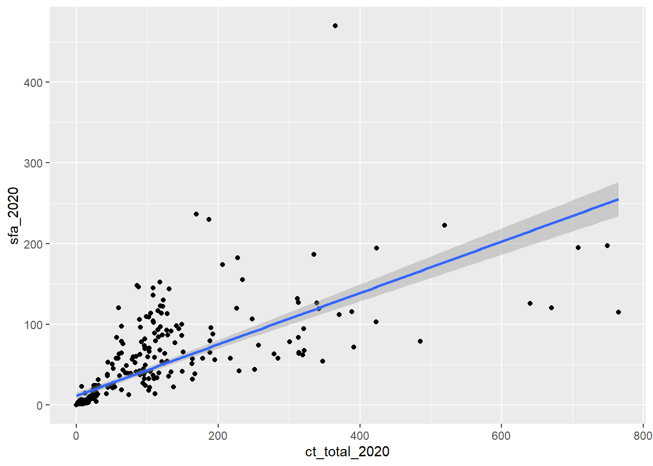
Hint: To reduce repetitive coding, setting aes in the ggplot function applies these to the entire object.
- A line of best fit for each group simply requires adding this to the
aesfunction as a colour:
ggplot(data = csp_nolon_2020,
       aes(x = ct_total_2020, y = sfa_2020, colour = region)) +
  geom_point() +
  geom_smooth(method = "lm")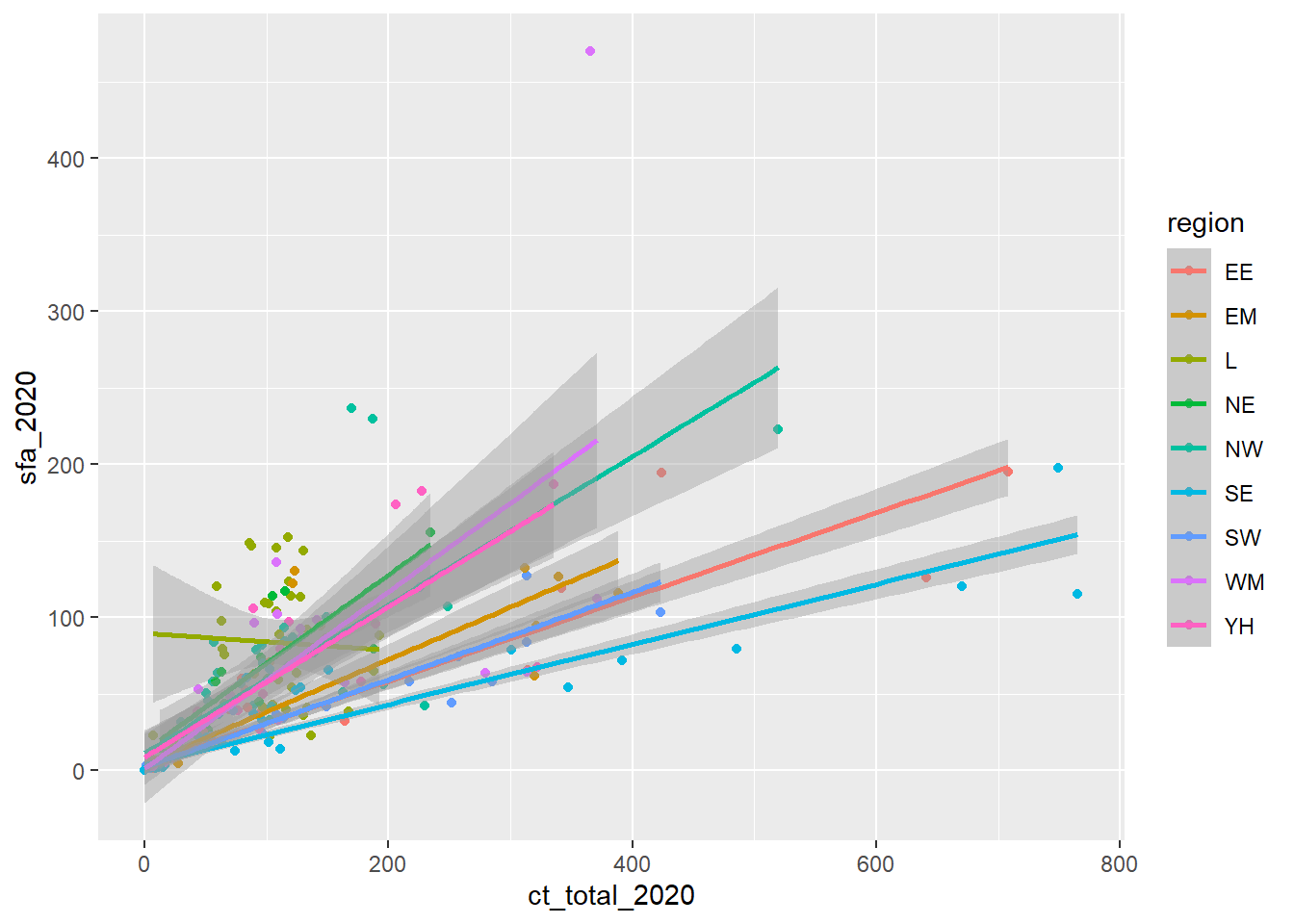
Exercise 7
Use an appropriate data visualisation to show how the total spend in each local authority has changed over the years between 2015 and 2020. Choose a visualisation that shows these trends over time and allows us to compare them between regions.
Solution
The most appropriate plot to show a change in variable over time is a line graph (with year on the x-axis and spend on the y-axis). To compare these between regions, we could set the colour of these lines, but as there are so many local authorities, this would overload the graph and make it hard to compare. As an alternative, we can facet this graph by region to show the line graphs on the same scale on the same output.
Be sure to set appropriate axis labels, font sizes, etc.
# Remove the Greater London Authority duplicate
csp_long2 %>%
  filter(authority != "Greater London Authority") %>%
  ggplot() +
  # Need to add a group to know what each line represents
  geom_line(aes(x = year, y = total_spend, group = ons_code,
                # OPTIONAL: colour by region to make it prettier!
                colour = region)) +
  facet_wrap( ~ region) +
  labs(x = "Year", y = "Total core spending power (millions)") +
  # Add theme_light to make the background a nicer colour
  theme_light() +
  # Rotate the x-axis labels to avoid overlap
  theme(axis.text.x.bottom = element_text(angle = 45),
        # Remove the legend (not needed, we have labels on the facets)
        legend.position = "none")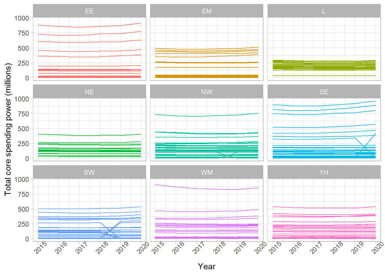
Exercise 8
Create an RMarkdown file that creates a html report describing the trends in core spending power in English local authorities between 2015 and 2020. Your report should include:
- A summary table of the total spending per year per region
- A suitable visualisation showing how the total annual spending has changed over this period, compared between regions
- A short interpretation of the table and visualisation
Note: You are not expected to be an expert in this data! Interpret these outputs as you would any other numeric variable measured over time.
Solutions
There are many different correct solutions to this exercise. All RMarkdown files should begin with a YAML header similar to the one below:
---
title: "Core spending power in English local authorities, 2015 - 2020"
author: Sophie Lee
output: html_document
---
Next, you may have a code chunk that sets up the global chunk options, loads any packages you needed, and loads the data that we will be using for the report. For example:
```{r setup, include = FALSE}
# Set global chunk options to not show R code or messages
knitr::opts_chunk$set(echo = FALSE, message = FALSE)

# Load the tidyverse package
library(tidyverse)

# Load the long dataset
csp_long2 <- read_csv("data/CSP_long_201520.csv")
```
You may have began with an introduction using RMarkdown syntax:
# Introduction
The following report will investigate the trends in core spending power
across England between 2015 and 2020. All values are give in millions
of pounds.

The core spending power was made up of the following provisions:

- Settlement funding assessment (SFA)
- Compensation for under-indexing the business rates multipliers
- council tax
- New homes bonus
- New homes bonus returned funding
- Rural Services Delivery Grant (RSDG)
Followed by a summary table, created using summarise and displayed using kable:
# Total core spending power by region
Below is a summary table containing the total core spending power per year
per region, given in millions of £:

```{r csp total summary table}
csp_long2 %>%
  group_by(region, year) %>%
  summarise(min_spend = min(total_spend),
            max_spend = max(total_spend),
            median_spend = median(total_spend),
            iqr_spend = IQR(total_spend)) %>%
  ungroup() %>%
  knitr::kable(.,
               col.names = c("Region", "Year", "Minimum",
                             "Maximum", "Median", "IQR"))
```
Then an additional code chunk producing a faceted line chart, similar to the one in Exercise 7:
```{r}
csp_long2 %>%
  filter(authority != "Greater London Authority") %>%
  ggplot() +
  geom_line(aes(x = year, y = total_spend, group = ons_code,
                colour = region)) +
  facet_wrap( ~ region) +
  labs(x = "Year", y = "Total core spending power (millions)") +
  theme_light() +
  theme(axis.text.x.bottom = element_text(angle = 45),
        legend.position = "none")

```