Choose an appropriate visualisation to investigate the change in household disposable income between 2012 and 2024. Comment on your findings.
Solution
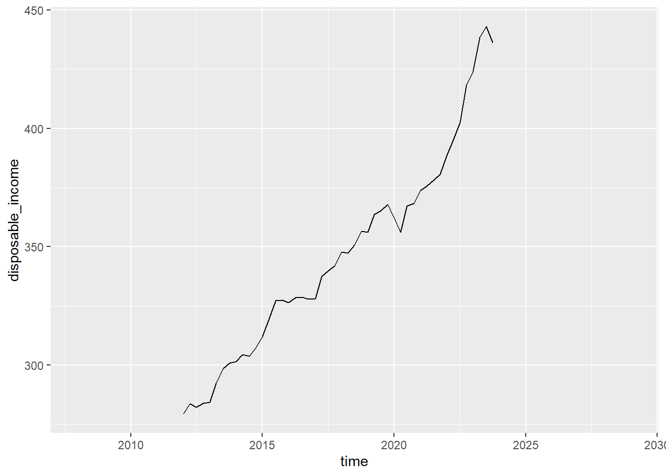
An appropriate visualisation to investigate how a continuous variable changes across time is a line graph. This can be created using the geom_line function and requires the disposable income on the y-axis and a time variable on the x. The dataset does not currently contain an appropriate time variable that takes account of both the year and the quarter. Therefore, we will need to create one before we generate the plot:
obr_data %>%mutate(time = year + ((quarter -1) * .25)) %>%ggplot() +geom_line(aes(x = time, y = disposable_income))
1
Create a time variable that takes the value of the year for the first quarter, and then increases by .25 for each subsequent quarter
2
The data has already been specified by piping it into the ggplot function
Disposable income has increased over the past 12 years, with small decreases around 2020 and in the first period of 2024.