Return to the visualisation showing the change in disposable income over time, decomposed into different income streams (labour, non-labour, and taxes and benefits). Adapt the visualisation to ensure it is accessible, compelling, and clear. This can include:
Adding an appropriate title and caption with data source information
Adapting the colour scheme to make the differences more obvious
Adding labels to commmunicate important findings to the reader
Adjusting the theme to ensure text is large enough, values are clear but not overwhelmed by ‘chart junk’
Save this visualisation and add it into a Word document, along with a brief interpretation of the visualisation.
Solution
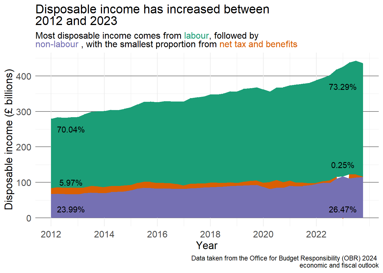
There is no correct answer to this exercise, the solution provided here is a suggestion based on data visualisation principles covered in this chapter and my personal preference. I have added a title to make the visualisation clearer and a footnote with data source information. I have added the percentage of disposable income to each segment in 2012 and the last quarter of 2023 to make the changes more obvious.
The colours I have chosen to represent each income type cone from the R colour brewer palette Dark2 which is colour blind friendly and ensures the sections are distinct. Rather than including a legend, I have chosen to change the colour of the text in the subtitle to align with the income type. This is done using the ggtext package. You are not expected to know this but it is included as an idea for future work For more information and example code, visit the package website.
pacman::p_load(ggtext)disp_income_long <- obr_data %>%mutate(time = year + ((quarter -1) * .25)) %>%select(time, labour_income, nonlabour_inc, net_tax_benefits) %>%pivot_longer(cols =-time, names_to ="income_type", names_transform =list(income_type = as.factor), values_to ="value")perc_income <- disp_income_long %>%filter(time ==2012| time ==2023.75) %>%group_by(time) %>%mutate(perc_income = (value /sum(value)) *100,perc_clean =paste0(round(perc_income, 2), "%")) %>%ungroup()ggplot(disp_income_long) +geom_area(aes(x = time, y = value, fill = income_type)) +scale_fill_brewer(palette ="Dark2", guide ="none") +scale_x_continuous(breaks =seq(2012, 2022, by =2)) +labs(title ="Disposable income has increased between <br> 2012 and 2023",subtitle ="Most disposable income comes from <span style = 'color:#1b9e77;'>labour</span>, followed by <br> <span style = 'color:#7570b3;'>non-labour</span> , with the smallest proportion from <span style = 'color:#d95f02;'>net tax and benefits</span>",x ="Year", y ="Disposable income (£ billions)",caption ="Data taken from the Office for Budget Responsibility (OBR) 2024 \n economic and fiscal outlook") +annotate("text", x =2012.75, y =250,label =filter(perc_income, time ==2012, income_type =="labour_income")$perc_clean) +annotate("text", x =2012.75, y =25, label =filter(perc_income, time ==2012, income_type =="nonlabour_inc")$perc_clean) +annotate("text", x =2012.75, y =100, label =filter(perc_income, time ==2012, income_type =="net_tax_benefits")$perc_clean) +annotate("text", x =2023, y =370, label =filter(perc_income, time ==2023.75, income_type =="labour_income")$perc_clean) +annotate("text", x =2023, y =25, label =filter(perc_income, time ==2023.75, income_type =="nonlabour_inc")$perc_clean) +annotate("text", x =2023, y =150, label =filter(perc_income, time ==2023.75, income_type =="net_tax_benefits")$perc_clean) +theme_minimal() +theme(plot.title =element_markdown(size =16),plot.subtitle =element_markdown(size =12),panel.grid.major.y =element_line(colour ="grey45"),axis.title =element_text(size =14),axis.text =element_text(size =12))
1
Load in the ggtext package (if using)
2
pivot the original data into the wide format required for this visualisation
3
Begin by calculating the percentage of disposable income that is made up of each different source. Create a ‘tidy’ version of this which can be added to the visualisation
4
Use the Dark2 palette for the area fills, determined by income type, and remove the legend (guide = "none")
5
Adapt the x-axis labels to show every 2 years
6
Add an informative title
7
Add a subtitle, showing each income type in the colour it is represented in the graph (this code is adapted from the ggtext webpage) as an alternative to a legend
8
Add a text label showing the percentage of disposable income made up by each income type at the start and end of the period (the label is taken from the percentage we calculated above)
9
Check that titles and text are large enough, make the y-axis gridlines bolder and easier to interpret.