Disposable income is the sum of labour income, non-labour income, and net taxes and benefits. Decompose the time series created in Exercise 7 to show how the contribution of these elements to total disposable income varied across time.
Solution
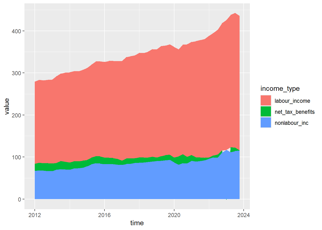
A stacked area chart (generated using geom_area) would allow us to visualise the total disposable income, broken down into the different income streams. The stacked area chart is created by layering each income value on top of one another, using a categorical variable representing income type to determine the area fill. This layout will require us to pivot the data to convert it into a long format.
obr_data %>%mutate(time = year + ((quarter -1) * .25)) %>%select(time, labour_income, nonlabour_inc, net_tax_benefits) %>%pivot_longer(cols =-time,names_to ="income_type",names_transform =list(income_type = as.factor),values_to ="value") %>%ggplot() +geom_area(aes(x = time, y = value, fill = income_type))
1
Create a time variable for the x-axis that accounts for both year and quarter
2
Select variables required for the visualisation
3
Pivot all variables apart from time
4
Use the current variable names to create a new variable named income_type
5
Convert the new income_type variable to factor (by default, R treats variable names as character)
6
Use the current income values to create a new variable named values